2023 Uniform kit
As the co-lead and manager of the Boston Hurricanes Athletic club's design team, I am also in charge of jersey and apparel design. I mainly focus on the Men's volleyball jerseys and shorts. Most of our designs are based on locations of the tournaments and representing different meanings.
2023 Uniforms
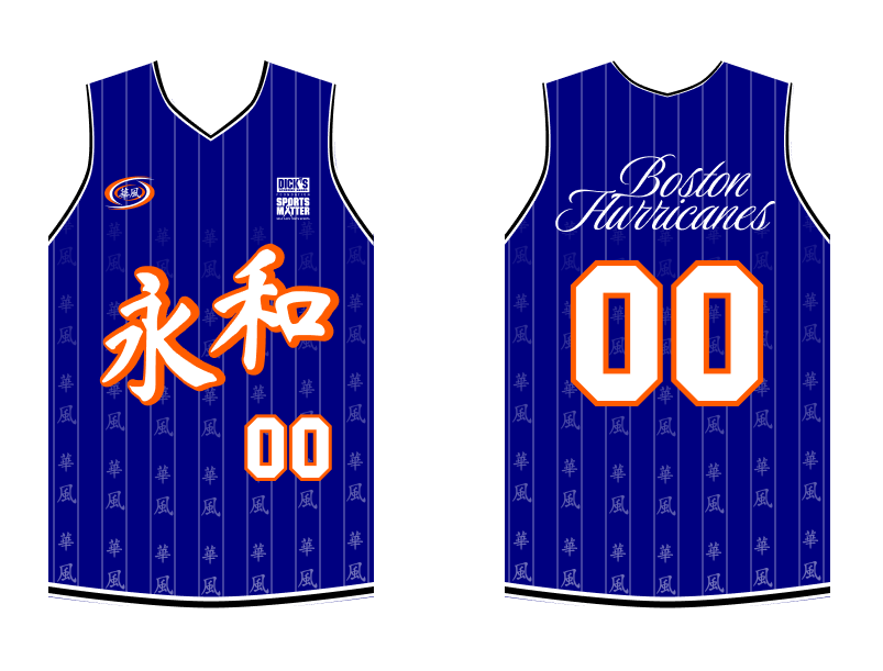
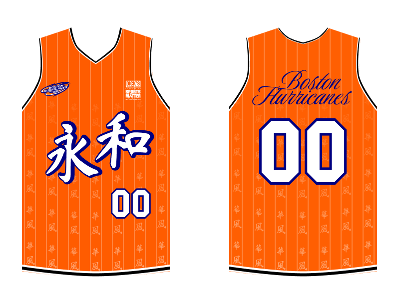
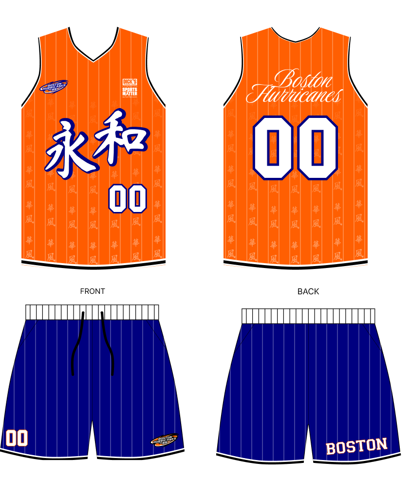
For 2023, we wanted to introduce the new logo. As a result, we wanted a jersey that was simple, clean and had cues to our 1970s roots. In our club's original jersey designs, the teams used a bright orange and the Chinese "Wing Wor". For the throwback feel, we went with 2 mono-color pinstripe jerseys. The first jersey (left) used the original Hurricanes logo with white and orange font. This is the classic base that we used from the late 2000s - late 2010s. To add to this throwback feel, we used stylized cursive font for the "Boston Hurricanes". As with our logo design, we strive to have a mix of Chinese and English on our jerseys. However, we also wanted to show a transition between the "old" and the "new". We had the "Big Wind" Chinese fading into view. We also reserve the top left patch for one of our sponsors, Dick's Sporting Goods
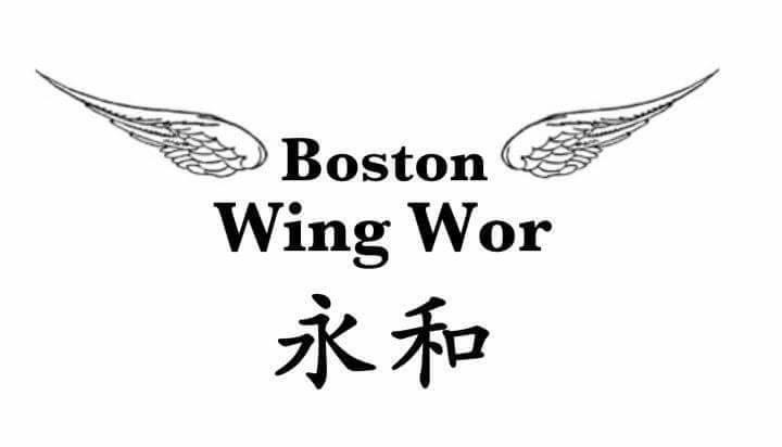
1970s secondary logo
For the second half of the 2023 season, we released an alternative jersey to introduce our new logo. We changed the coloring so that our base was orange and secondary color was blue. This colorway was the club's primary color scheme from the 1970s-1990s. We also introduced complementary shorts.
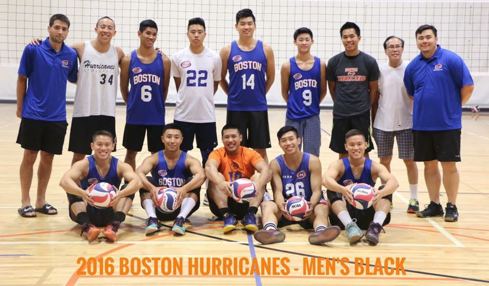
jersey variations from late 2000s - late 2010s:
mainly blue base with orange/ white font
Shorts

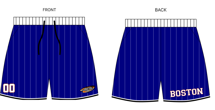
We wanted to create full uniform kits. For this year, we introduced two shorts: club organization "Slunks" shorts and alternative jersey shorts. These two shorts are very similar with similar coloring and base patterns. We also placed our logo at the bottom edge of the shorts and placed "Boston" on the back of the short. For the jersey shorts, they maintained the same striped pattern and had matching jersey numbers.
For "Slunks", we played with our Hurricanes/ "big wind" moniker. On one leg sleeve, I designed a 2D cloud and sky pattern following the patterns of Xiangyun traditional Chinese clouds. The other sleeve is blank to emphasize the logo on the front and the Slunks logo in the back. These cloud shorts needed to be standalone shorts and could be used with multiple jerseys or shirts, as these shorts were for all club members and will be sold.
2022
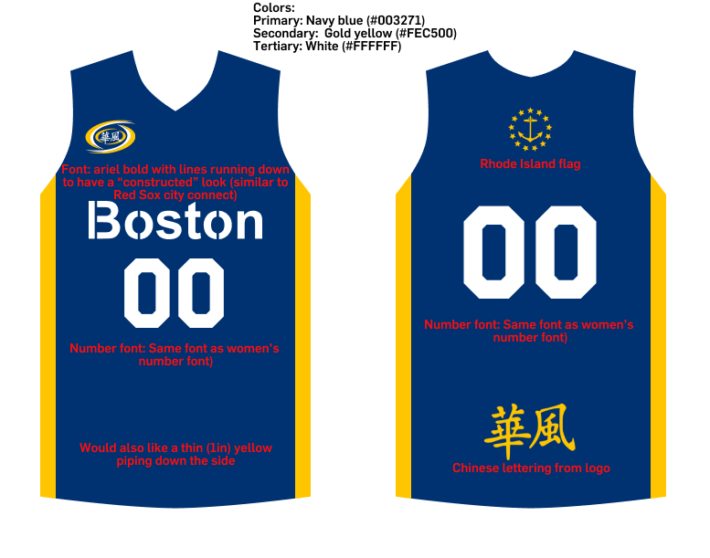
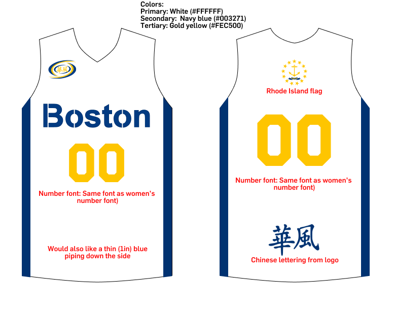
In 2022, we were holding our first National tournament in Rhode Island. One unique aspect about our club is that we are more New England based, with Asian Americans coming from other New England states. One of our largest represented states is Rhode Island, so we wanted to have a jersey that showed a Rhode Island -- Massachusetts connection . The jerseys were the color of the Rhode Island flag, with a mix of blue/ yellow/ white. We placed the RI anchor logo on the top back of our jerseys. On the front, we wanted to show our connection with Boston. The top right had our traditional logo but in RI colors. For the font, we wanted to play with a font that paid homage to Boston. I took inspiration from the alternative Boston Red Sox jerseys, and designed a deconstructed athletic font.