
I am the co-lead and manager of the Design team for the Boston Hurricanes. The Boston Hurricanes is an athletics club that gives kids and adults from the Chinatown community space to connect through sport and volunteer work. We strive to build life-long communities, friendships and encourage the pan-Asian cultures throughout New England. I have been in their volleyball system since 2012 and on their Leadership team since 2020. I co -lead the design team, social media, apparel and help plan events.
Color PALLET
Our primary colors have traditionally been Navy blue and Syracuse Orange since the 1970s. We have created slight variations of our primary colors to depict different messages and illustrations. Our designs use a mix of modern layouts and imagery while integrating references to our original color pallet, fonts and designs.
Logo redesign
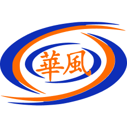
Original Hurricanes Logo, from 1970
For over 50 years, we have used the original logo to represent our basketball and volleyball teams. The original logo was simple and clean, with the outer swishes to represent stylized swirling wind of a Hurricane. In the center of the swirls are the characters for "Hurricane" in Chinese.
Starting in 2022, we wanted to modernize our logo. Our main objectives were:
1) create a logo with more perceived motion
2) Make a logo that is fun and inviting for different age groups and populations
3) Modularize the logo so that it can be simplified or re-used across different use cases
1) create a logo with more perceived motion
2) Make a logo that is fun and inviting for different age groups and populations
3) Modularize the logo so that it can be simplified or re-used across different use cases
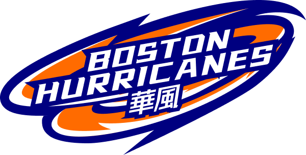
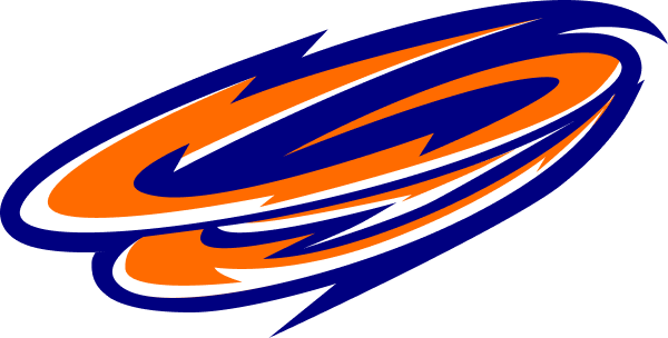
Our approach was to create a flattened "3D" image with a mix of our primary color pallet to achieve motion. We turned the Hurricane image isometrically, then created repeated layers of swirling wind. We also tweaked the colors so that they contrasted more and provided more of a "pop":

We created 3 layers of rings with motion going from bottom left to top right. This created a perceived spin, similar to a tropical storm. We wanted to create an image that could be used on its own. Next, we wanted to create text and font that made the logo fun and inviting. Our goal was to incorporate both English and Chinese, as we wanted to emphasize we are an Asian American club. We took influence from cartoon and anime styling to incorporate more "Asian American" styling. The font is based on an Athletic "Buzz City" font. We also wanted to show that our club invites younger generations.