I have been in charge of developing logos for Koi Prosthetics and the multiple projects that fall under the startup. I have graphic design experience through past courses and for an athletic club in Boston. I enjoy graphic designing just for fun, too.
This is the Koi Prosthetics logo. It is modular and geometric, representing the goal of our low-cost prostheses. In addition, Koi fish represent perseverance and overcoming adversity in Asian countries, which is fitting since our work is aimed for developing Asian countries.

The RiseUP/ GrowUP logo was put together during Brown Hack Health. What made our transfemoral prosthetic socket so unique is its ability to be adjusted both in diameter and in length. The prominent arrow creates the upward motion, and the three holes represent how our length adjustments work. With our socket, these patients can "rise up" again and walk normally.
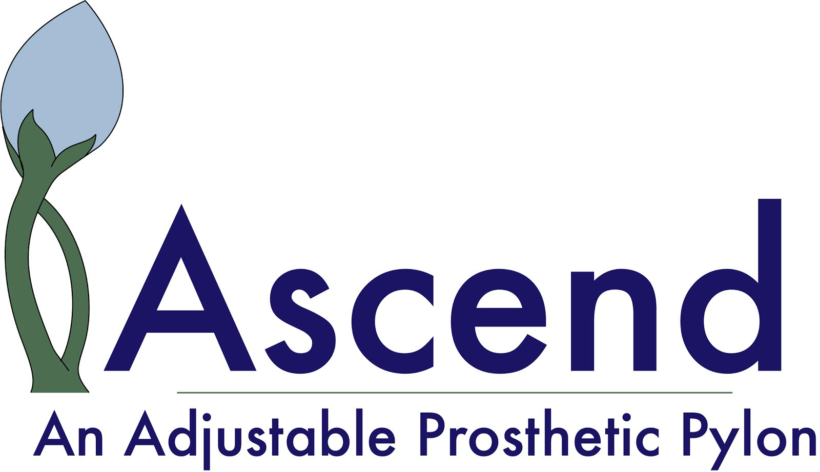
The other capstone project that was done under Koi Prosthetics was project Ascend. They worked on creating an adjustable pylon for growing children in developing countries. The constraint was to play around with a nature theme. The design plays on the shape of the tibia and fibula, except through a plant. The two stems meet at a bud, a growing plant. Budding plants are young and will develop into a beautiful flower. The goal of this project was to create a pylon to provide children amputees the opportunity to grow up alongside their peers. It helps them return back into society without having to go through the hassle of refitting their prosthetics every few months, which are difficult to do in these developing countries.